Change the campaign story font style (header or body), size, and colour to add visual appeal to your campaign story, break up long pieces of text and make it easier for the eye to read.
For personal campaigns – the font type remains at ConnectionPoint’s default (Arial/Open Sans) and cannot be changed.
For organizations – you may choose header and body font types in your organization profile’s theme menu.
Changing the campaign story font style and size #
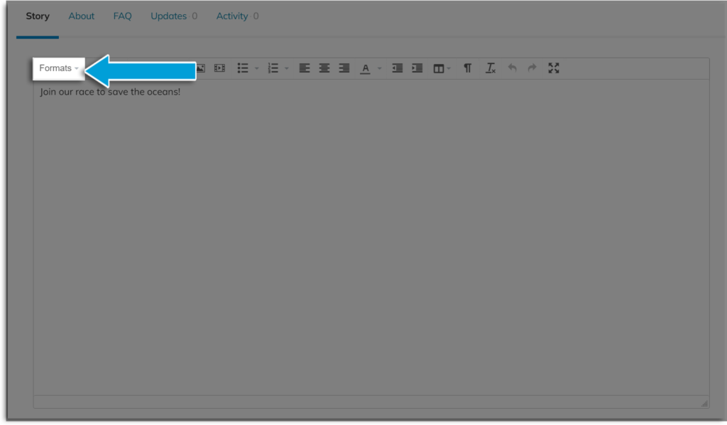
STEP 1 – Open your story editor, then click ‘Formats’ in the options.

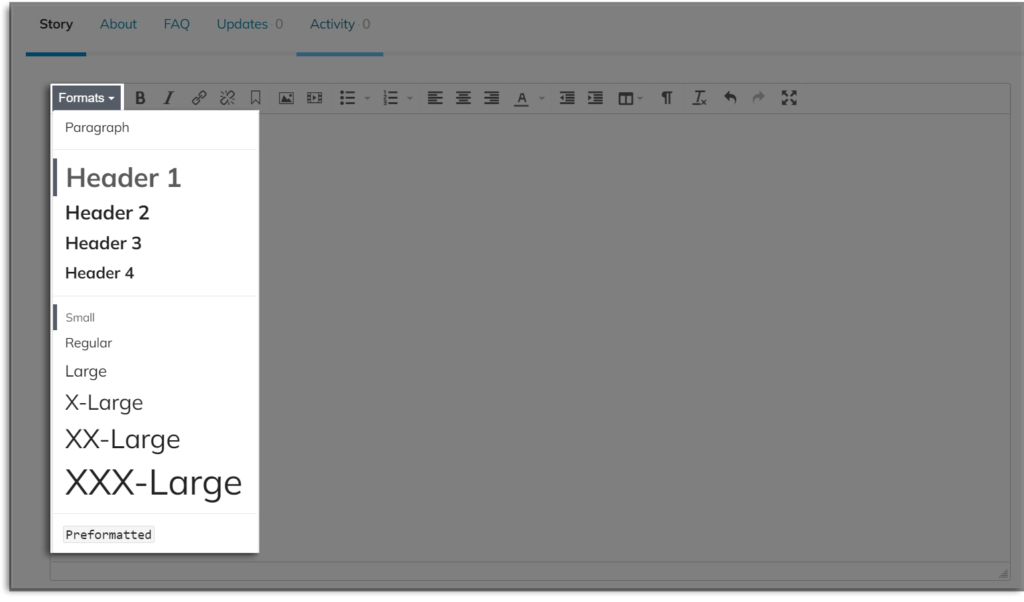
STEP 2 – Choose either ‘Paragraph’ for the body font or a ‘Header’ size for the header font. Then choose a size from small to xxx-large.

Changing the story font colour #
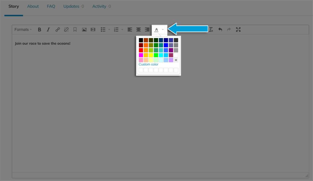
Click the dropdown next to the font colour. If you need to enter a custom colour code, click ‘Custom colour.’

Best practices for campaign story font style #
- Be consistent. Use one or two different sizes and colours. A rainbow of colours in different sizes looks confusing, messy, and unprofessional
- Emphasize headings and sub-headings. Use larger font sizes, bold, or different colours for these to break up the content and make it easier for readers to skim. And yes, they will skim.
- Prioritize readability. Choose fonts and colours that are easy to read. Light yellow, flowy script won’t be your friend.
- Highlight important information. Whatever you deem most important in your story, bold it, underline it, write it in a secondary colour, or choose a bigger size to make it stand out.
- Be mindful of accessibility. This goes hand-in-hand with readability. Consider those with low vision when choosing size and colour.
- Make sure it looks good on all devices. This article explains how to preview your campaign in desktop, tablet, and mobile phone modes.


