Responsive preview refers to viewing your campaign as it would appear on different devices – mobile phones, tablets, and desktops. Most supporters view campaigns on mobile devices, so make sure your campaign looks great on all devices!
Make sure your story looks great on ALL devices: Desktop, Tablet, and Mobile views. We’d hate for you to spend an hour making sure your campaign looks perfect on a desktop only to have the mobile version look not so great…
ALL pictures and columns will line up one on top of the other in mobile mode, so be careful of big spaces, squished lettering, and other general funkiness that might appear if you haven’t been factoring this in.
Navigating to the responsive preview #
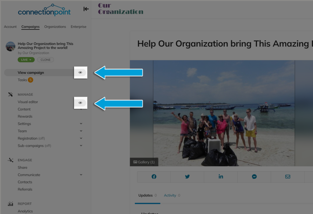
Click the eye icon next to ‘View campaign’ or ‘Visual editor’ in your campaign’s navigation menu. There is no difference between the two.

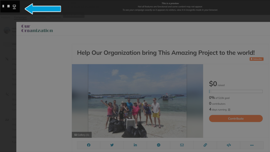
View your campaign in all modes by clicking the options in the top-left of the preview screen.

Formatting tips #
Here are some tips to help you create an engaging campaign that looks good and functions well on various devices:
- Simplify your layout.
- Keep the design clean and uncluttered to make it easy for users to navigate on smaller screens.
- Columns inserted on a desktop will automatically revert to a single, vertical orientation for phones
- Optimize images and media.
- Use high-quality images and videos that are optimized for the web to reduce load times on mobile devices.
- Use concise and scannable content.
- Break up text into smaller paragraphs and use headings, bullet points, and lists to make it easier for supporters to scan your campaign on smaller screens.
- Keep your pitch concise and focus on the most important information.
- Test across different devices.
- Test your campaign page on various devices and browsers to ensure that it displays correctly and functions smoothly.
- Pay attention to load times and make sure that your campaign loads quickly on mobile devices.
- Prioritize mobile optimization.
- Given that many users browse crowdfunding campaigns on their mobile devices, prioritize mobile optimization during the design process.
- Ensure that all features, such as buttons and forms, are easily tapable and functional on touch screens.


